About this project
The purpose of creating a mock brand challenge is to develop and refine branding, design, and marketing skills in a real-world context. By treating the mock brand as an actual client, it allows for exploration of creative ideas, problem-solving, and the opportunity to practice delivering professional solutions. This exercise builds confidence, showcases capabilities, and sharpens the ability to craft cohesive and compelling brand identities.
Client Questions
- What is the name of your business/organization?
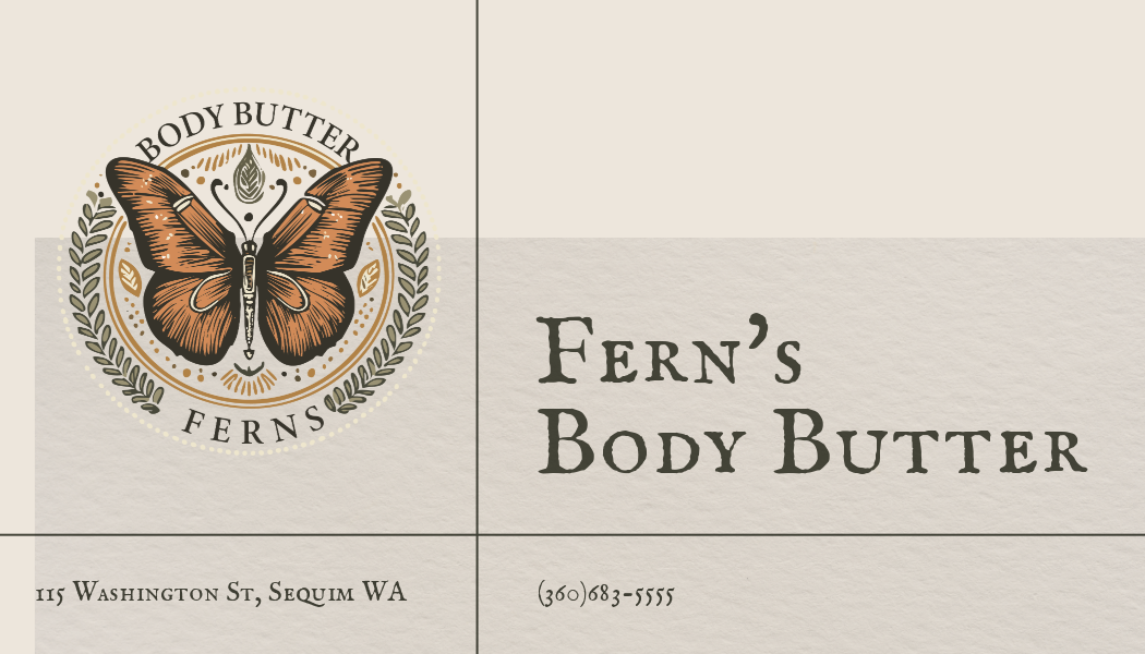
Fern's Body Butter. - What does your business do?
Fern's Body Butter specializes in creating luxurious, handcrafted body butters using natural ingredients, designed to nourish and moisturize the skin while offering a touch of indulgence. - What is your mission or purpose?
The mission is to bring a sense of self-care, luxury, and connection to nature into everyday skincare routines by crafting high-quality, eco-conscious body butter. - What sets you apart from competitors?
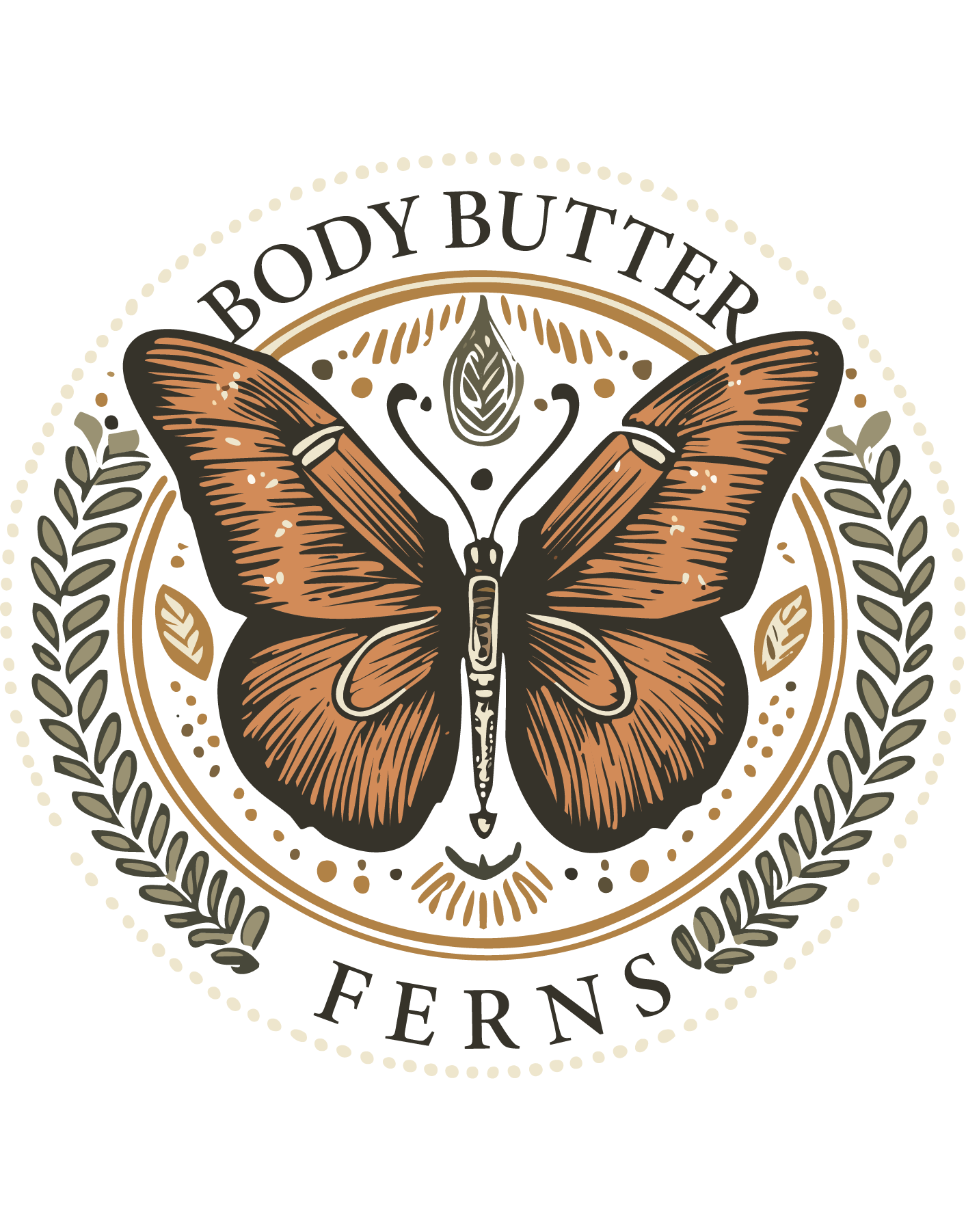
Fern's Body Butter stands out with its emphasis on natural, sustainable ingredients, beautiful artisanal packaging, and a brand aesthetic inspired by nature, evoking elegance and harmony. The butterfly icon symbolizes transformation, beauty, and care. - Who is your target audience?
Higher-income women aged 50-59 who value quality skincare products and enjoy shopping at artisan markets, particularly in Sequim, WA, and similar small-town, upscale communities. - How would you describe your brand in three words?
Natural, Elegant, Nourishing. - What emotions or messages should the logo convey?
The logo should convey feelings of sophistication, warmth, and a deep connection to nature. It should evoke trust in the quality of the product and a sense of personal indulgence. - What are your brand’s core values?
- Sustainability and eco-consciousness
- Quality craftsmanship
- Celebration of natural beauty and transformation
- Support for local and artisanal traditions
- What style of logo are you drawn to?
A rustic yet polished design, incorporating organic elements (like leaves and butterflies) that feel timeless and elegant. A circular design with detailed illustration would give the logo a handcrafted, boutique feel, perfectly in line with the brand's identity.


